
The Best Multi-Timeframe Combination for Crypto Bias (Stop Mixing Random Charts)
Introduction: You're Comparing Two Charts That Aren't Actually Related
You check the 4-hour chart for bias, then drop straight down to the 1-minute chart for entries, because that's the workflow most multi-timeframe content describes — check a higher timeframe, then execute lower. Except the two charts keep disagreeing in ways that feel arbitrary, the 1-minute structure rarely seems to actually reflect what the 4-hour is doing, and the whole exercise starts to feel like checking two unrelated indicators rather than one coherent analysis.
That disconnect isn't a reading skill problem. It's a pairing problem. "Multi-timeframe" doesn't mean any two timeframes checked in sequence — it means timeframes chosen with a deliberate relationship to each other, close enough in scale that the structure on one is actually a zoomed-in view of the structure on the other. A 4-hour chart and a 1-minute chart aren't that. The gap between them is wide enough that the 1-minute chart is showing you a different, largely independent layer of market behavior, not a magnified version of the 4-hour's structure.
It's worth being direct about why this particular pairing is so common despite being poorly scaled: 4-hour bias and 1-minute execution is a popular combination in retail content because it maps neatly onto "big picture plus fast entries," which sounds intuitively reasonable. The problem isn't the intuition behind wanting a big-picture read and a fast entry trigger — it's that the specific timeframes chosen to represent those two roles are too far apart to actually be structurally connected to each other.
This post covers why timeframe separation has to fall within a specific ratio range to produce genuinely related analysis, what breaks down when that ratio is too small or too large, and the three-tier framework that keeps higher-timeframe bias, mid-timeframe structure, and lower-timeframe entries actually connected to each other rather than three separate readings bolted together.
The Core Logic: Why the Ratio Between Timeframes Matters
Why "Multi-Timeframe" Doesn't Mean "Any Two Timeframes"
The entire premise of multi-timeframe analysis is that market structure is fractal — the same kinds of patterns, break of structure (BOS), change of character (CHoCH), and displacement, occur across timeframes, with a higher timeframe's structure being built from the accumulated structure of the timeframe below it. That relationship only holds meaningfully within a certain scale range. Compare timeframes too far apart, and the lower one stops being a magnified view of the higher one's structure — it becomes its own largely independent sequence of noise that happens to sit underneath the higher timeframe chronologically, without genuinely reflecting it.
The Structural Ratio: Why Roughly 4-6x Separation Tends to Hold Together
A separation of roughly four to six times between adjacent timeframes tends to preserve the fractal relationship well — enough compression to meaningfully zoom in on execution detail, without so much compression that the lower timeframe's structure becomes disconnected from the higher one's. A 4-hour to 1-hour pairing, a 1-hour to 15-minute pairing, or a 15-minute to 3-minute pairing all sit roughly within that range. Each lower timeframe in these pairs is still recognizably a magnified view of the higher one's recent structure, rather than an unrelated chart that happens to share a symbol.
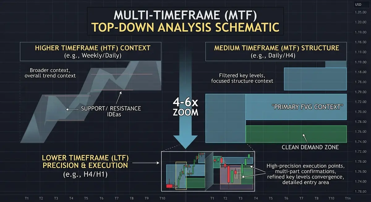
What Happens When the Ratio Is Too Small or Too Large
Pair timeframes too close together — a 15-minute and a 10-minute chart, for instance — and the two become largely redundant, showing nearly the same structure with only marginal additional detail, which defeats the purpose of using two timeframes at all. Pair them too far apart — a 4-hour and a 1-minute chart — and the relationship breaks in the opposite direction: the 1-minute chart's structure is dominated by short-term noise that has no meaningful connection to what's driving the 4-hour's current bias, so "checking the 1-minute for entries" stops being execution within a confirmed bias and becomes trading a mostly independent, much noisier signal that happens to share a directional label.
Both failure modes are easy to diagnose after the fact by looking at how often the two charts actually agree. Timeframes paired too closely will nearly always agree, because they're effectively showing the same information twice — which should be a signal that little is being gained from the second chart, not confirmation that the setup is strong. Timeframes paired too far apart will disagree unpredictably, with no consistent relationship between how the higher timeframe is behaving and what the lower timeframe happens to be doing at any given moment — which should be a signal that the two charts aren't actually structurally related, not that the market is simply choppy.
HTF Bias, MTF Structure, LTF Entry: The Three-Tier Framework
A properly scaled multi-timeframe approach uses three tiers rather than two, each within the appropriate ratio of its neighbor: a higher timeframe (HTF) for overall directional bias, a mid timeframe (MTF) for the structural detail — BOS, CHoCH, and order block formation — that bridges bias to execution, and a lower timeframe (LTF) for the actual entry trigger. Skipping the middle tier and jumping directly from HTF bias to LTF entry is exactly what produces the disconnected-chart feeling, because the ratio between the two remaining tiers is now too wide for one to be a genuine zoomed-in reflection of the other.
Why Timeframe Pairing Alone Doesn't Guarantee Alignment
Choosing a well-scaled ratio between timeframes is necessary but not sufficient — the tiers still need to actually agree in direction before a trade is justified. A properly scaled HTF, MTF, and LTF setup where the HTF is showing a bullish bias, the MTF is showing bearish structure, and the LTF is showing a bullish entry trigger is still a contradictory setup, regardless of how appropriately the timeframes were chosen relative to each other. Correct scaling makes the comparison meaningful; it doesn't automatically make the tiers agree.
This distinction matters because it's easy to treat "I fixed my timeframe ratio" as the end of the fix, when it's really the precondition for a meaningful comparison rather than a guarantee of a good outcome. Getting the ratio right means that when the three tiers do agree, that agreement is actually informative — reflecting a genuine fractal relationship rather than a coincidence between two unrelated charts. It doesn't mean agreement will always be present, and trading a setup where the tiers conflict, just because the timeframe spacing itself was chosen correctly, repeats the same underlying mistake in a different form.
The Bridge: How Multi-Timeframe Trend Solves This
Manually maintaining three separate charts at correctly scaled ratios, tracking bias on each, and checking whether all three currently agree is a workflow most traders simplify down to two charts out of convenience — which is exactly the simplification that produces a mismatched ratio and the contradictory readings that come with it.
Multi-Timeframe Trend is built around correctly scaled tier relationships by default rather than leaving the ratio choice to the user each time:
- Pre-configured ratio-appropriate tier pairings — the indicator's HTF, MTF, and LTF settings default to timeframe combinations that preserve the fractal relationship, rather than allowing an arbitrarily wide gap between tiers.
- Three-tier bias display — bias for all three tiers is shown simultaneously on the active chart, so alignment or contradiction is visible at a glance rather than requiring separate chart switches.
- Contradiction alerting — the tool flags when tiers disagree in direction, surfacing exactly the scenario where correct timeframe scaling still doesn't guarantee a tradeable setup.
- HTF bias overlay on the LTF chart — the higher-timeframe directional read is displayed directly on the entry-timeframe chart, keeping the entry trigger visibly anchored to the broader bias rather than evaluated in isolation.
This connects directly to the contradiction problem covered in more depth in why your multi-timeframe analysis keeps contradicting itself — mismatched ratio is one major cause of that contradiction, though not the only one. And for a faster version of the HTF read itself, how to find your trading bias in under 10 seconds covers the quick-check method for establishing that top-tier bias before the rest of the framework is applied.
Execution: How to Read the Indicator on Your Chart
- Confirm your three tiers fall within the appropriate ratio before trusting the alignment read. If your configured HTF, MTF, and LTF settings span too wide a gap, correct the pairing before relying on the bias comparison.
- Check the contradiction flag before entering, not just the LTF trigger alone. A clean entry signal on the lowest tier still isn't a full setup if the tool is flagging disagreement between the higher tiers.
- Use the HTF bias overlay to filter LTF entries in real time. An entry trigger that fires against the displayed HTF bias should be treated with more skepticism than one firing in the same direction.
Frequently Asked Questions
What's the ideal timeframe combination for crypto day trading specifically? There's no single fixed combination that fits every style, but keeping roughly a four-to-six-times separation between adjacent tiers — for example 4-hour, 1-hour, and 15-minute, or 1-hour, 15-minute, and 3-minute — tends to preserve the fractal relationship that makes multi-timeframe analysis meaningful in the first place.
Can I use just two timeframes instead of three? You can, but skipping the middle tier means the remaining two are more likely to fall outside the ratio range that keeps them structurally related, which is often exactly what produces the disconnected, contradictory readings this post describes. Three tiers with appropriate spacing between each is generally more reliable than two with a wide gap.
Why do my higher and lower timeframe biases keep disagreeing even with a good ratio? A well-scaled ratio makes the comparison meaningful, but it doesn't force the tiers to agree — genuine disagreement between timeframes happens and is itself useful information, typically indicating the market is in transition or the lower timeframe is still working through short-term structure that hasn't yet resolved into the higher timeframe's direction.
Ready to Stop Comparing Charts That Don't Belong Together?
Multi-timeframe analysis only works when the timeframes you're comparing are actually related to each other — get the ratio right, and the contradictions that felt random start making structural sense.
Ready to implement this institutional logic? Deploy the Multi-Timeframe Trend indicator on your charts now.